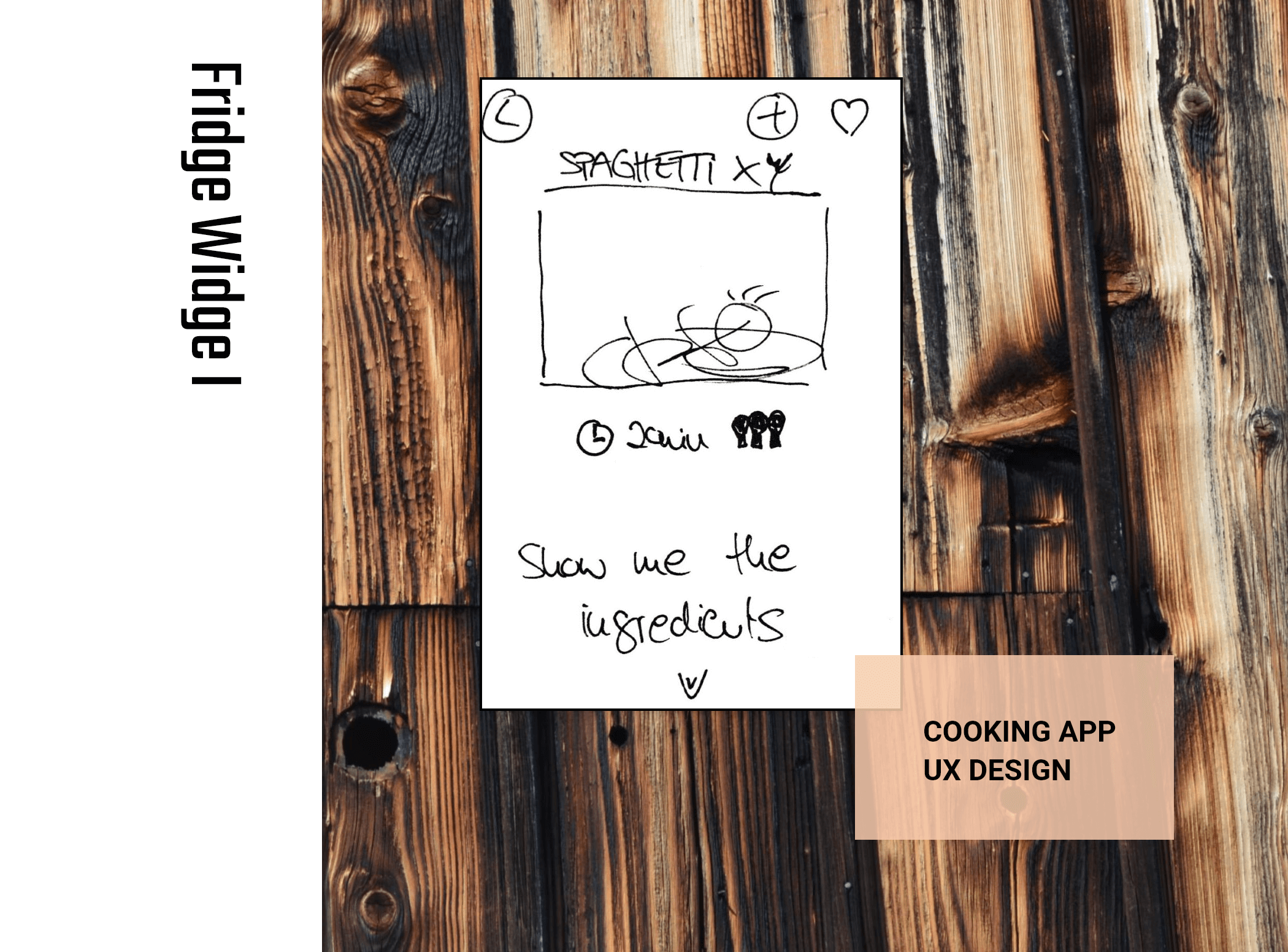
Proposal
The number of recipes on the web is impressive. But it can be hard to find a collection that fits your habits. Indeed. Thus, getting to know my target group/s was essential. Due to interviews and their intensification.
Process
The user personas give me a hand to keep the focus. Whilst conceiving the app from alpha to omega. This time, I was responsible for the whole process. Initiated by a competitor analysis. Thereby, I got an overview of the products which already exist.
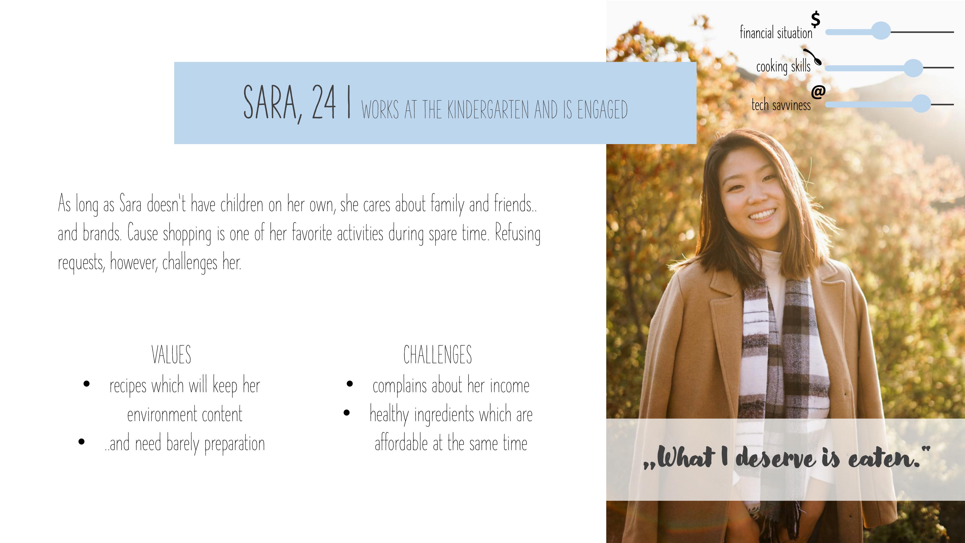
User personas
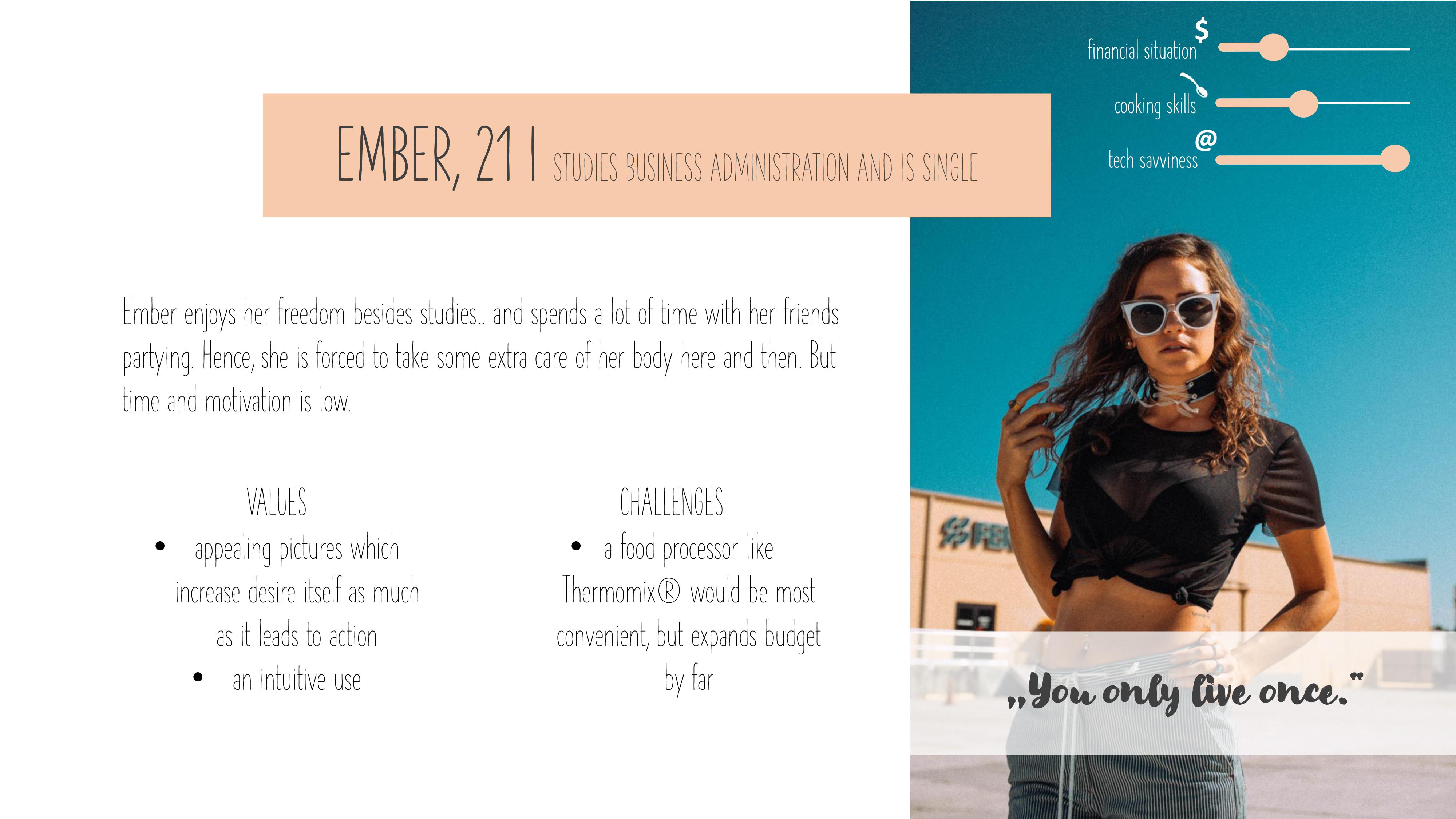
Challenges
As an expert you are inclined towards losing sight for real life struggles people may have with your product. So, set a timer. And be aware of the Minimal Viable Product you really need to achieve. Covering the following issues:
When I’d like to use the app for the first time, I expect an easy registration process, so that I can start right away.
When I am cooking, I should own every tool needed and be guided carefully, so that users will succeed.
When I’m looking for meals which I’d like to try the next days, I want it to be done quickly, so that I can handle nutrition with ease and joy.
User Stories
It may happen quickly that you get lost in details. Considering that designers usually follow an iterative process, time should, however, be used efficiently. By asking your users for feedback, for instance. Like I did next.
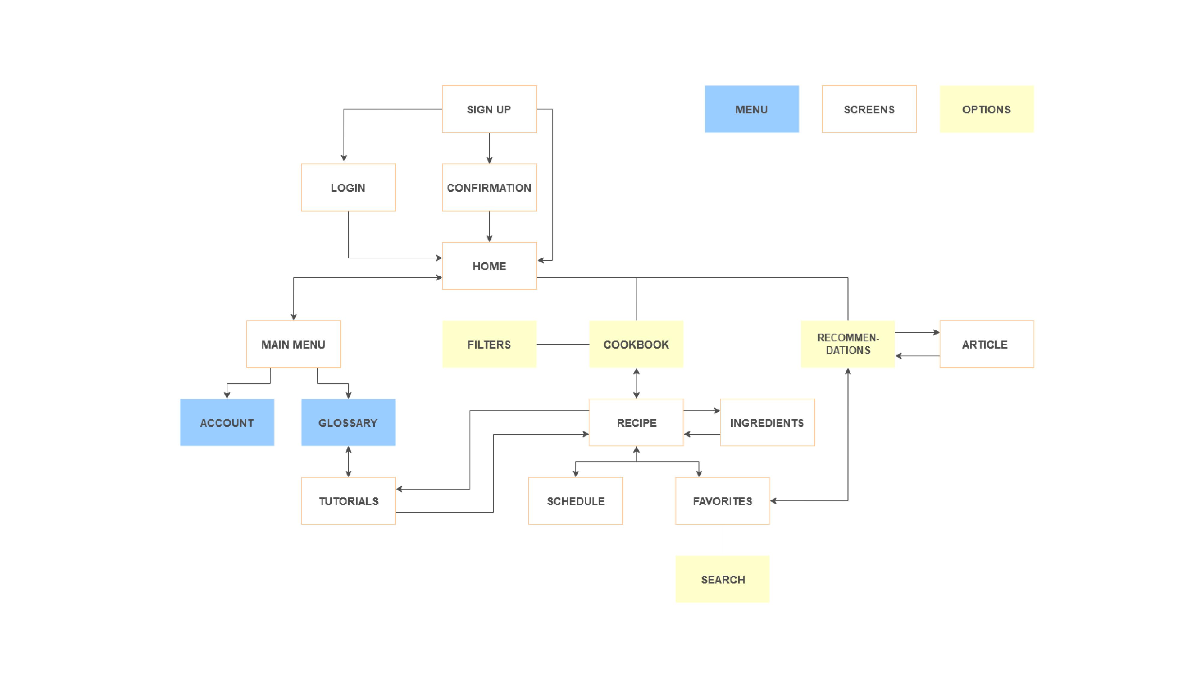
User Flow Diagram
To explore the neatest navigational structure of an app, rapid prototyping is recommended. If you don't feel artistic enough, tools like balsamiq give you a hand. Allowing really smooth sketches in just a minute. That suit as a click dummy.
To sum it up
I’d like to establish cooking apps as an equivalent to cook books within the German population. And strengthen
the intrinsic motivation by discovering skills users didn’t expect on themselves. Having fun.
Interactive Prototype
That's why I needed to do some adjustments before moving on to the design. Like..
- Integrating an onboarding for the schedule feature.
- Showing all the options to signup at the start. In an equivalent and known design.
- Using consistent icons during the cooking process. And, separating the actions within. Clearly. By common UI elements.
